Managed Dedicated Server Hardware Charts
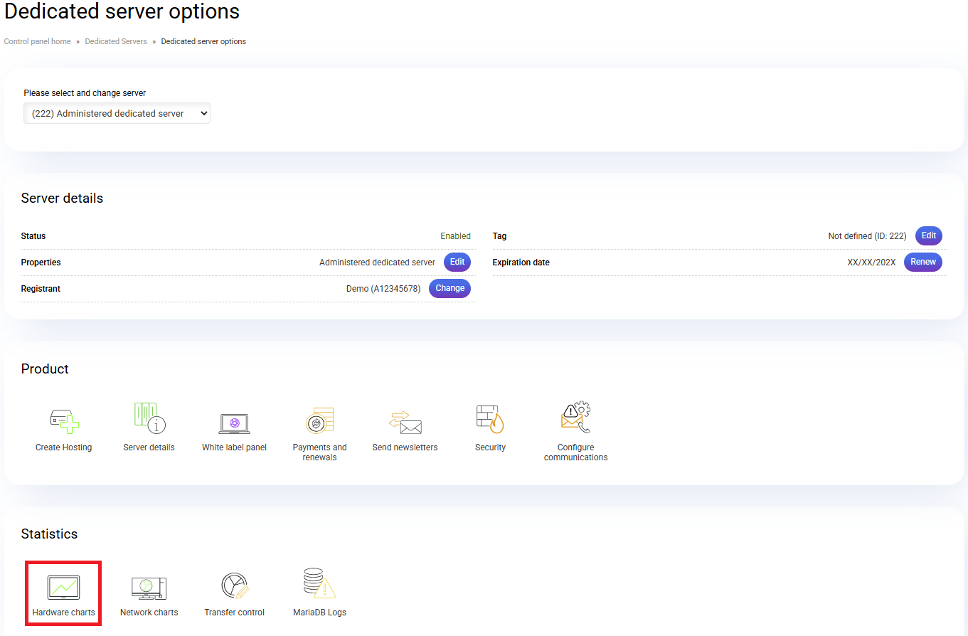
The hardware graphs allow you to visualize the status of your server. To access them, go to your server management from the control panel of cdmon and click on the option Usage graphs.

In the "Hardware graphs" section, you can view the following categories:
In the "Hardware graphs" section, you can view the following categories:
At the top of the graphs, you can choose to display the daily, weekly, monthly, or yearly usage.
CPU usage graphs per hosting
This graph shows a list of the ten hostings that consume the most CPU. The horizontal axis displays CPU usage per hosting by time range, while the vertical axis shows CPU usage in %. In this example, the server has 4 CPU cores, which equals 400 on the vertical axis.
System graphs
In this section, you can view the “CPU usage”, “CPU load”, and “Memory usage” graphs.
CPU usage: Represents the percentage of CPU usage. 100% represents the total number of cores on the server, i.e., the full CPU capacity.
- system: % used by the system.
- user: % used by system users.
- nice: % of low-priority user processes.
- idle: % of CPU “free” or not used.
- iowait: % of CPU waiting time for the hard drive.
- steal time: % of time a virtual CPU waits for its processing time on the physical CPU. In managed dedicated servers, this value does not apply since all CPUs are physical.
- softirq: % of interruptions while handling “batches” on the CPU.
Load average: The average CPU load over time.
Memory usage: Displays how the system memory is being used.
Web service graphs
This section shows graphs related to the Apache service, such as accesses or requests, processes, and load volume.
Apache accesses: Displays the web accesses recorded by the server at the time of measurement.
Apache processes: Number of Apache processes running on the server. They are divided between those already running and those ready to start but waiting for a connection request.
Apache volume: The traffic recorded through port 80 at the time of measurement.
Disk graphs
Filesystem usage: % of disk space used by each partition. “Total space” shows the full disk capacity, and “used space” indicates the portion already in use.
Mail service graphs
Number of emails in the Postfix queue: Graph that monitors the Postfix mail queue.
For more information, you can contact us.
Related Articles
Managed Virtual Server Hardware Charts
The hardware graphs allow you to visualize the status of your Virtual Up server. To access them, go to the Virtual Server management section from your cdmon control panel and click on the Hardware graphs option. In the "Hardware graphs" section, you ...Managed Virtual Up Server Hardware Charts
The hardware graphs allow you to visualize the status of your Virtual Up server. To access them, go to the Virtual Server management section from your cdmon control panel and click on the Hardware graphs option. In the "Hardware graphs" section, you ...Managed Dedicated Server Network Charts
Network Card Traffic 0: Network charts of mouth 0 of the server's main network card. Mouth 0 is the Internet connection of the dedicated server. Network Card Errors and Collisions 0: As the name indicates, this graph refers to lost data packets, ...Managed dedicated server information
If you need to check the features or status of your Managed Dedicated Server service, you must access the server management from your cdmon control panel and click on the Server information option. On the next screen, you will see three main ...Renew Managed dedicated server
In the following tutorial, we explain how to renew a Managed Dedicated Server. Access your cdmon control panel, go to the server management section, and click on the Renew option to add the Managed Dedicated Server to your shopping cart. An ...